Quick look Office 365 V Google Apps
Today being the launch of Microsoft Office 365, we thought we would have a nose around and see what the competition is making such a fuss about. Initial impressions are that the Microsoft online suite is far less functional than the offline versions of MS Office/Outlook, let alone compete with the elegance of Google Apps in the browser.
The disappointment started when not all the functions performed correctly in the Google Chrome Browser of choice (of course) and even changing to Firefox did not get all features working correctly. Watching the video on how to add your domain concerned us slightly, especially the piece about having to change the name servers on your DNS providers hosting table, what is that all about?
Outlook in the browser is completely under-whelming! Having never been a fan of Outlook, even after a decades worth of use, no way I could say I could leave Gmail and go back to Outlook. It looks to me a hybrid of Outlook and Hotmail neither of which come anywhere near the elegance of use of Gmail.
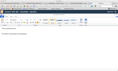
Web Apps from Microsoft appear to be linked to the sharepoint team sites, only allowing us to add content to the team sites, which is no where as intuitive as the Google Docs list. You can not even load folders or other file types, as it expects it all to be Microsoft. We love the feature of Google Docs to upload and convert other file types to be edited in the Browser. We have become to use to the “click-2-share” capabilities of Google Docs, that we found ourselves pining for the button, where is it? Bizarrely, none of the web apps had auto-save, another annoying PC feature that has made it into Office 365 Web Apps. On the plus side the app were quite fast to use in the browser, without any latency, unlike the rest of Office 365.
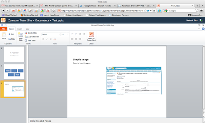
 Even the normally impressive Powerpoint lost all it’s animation and transitional capabilities meaning it looks less capable than Google Presentations. Besides, we converted all out PowerPoint presentations to Google format years ago.

Having grown use to Google Sites making web sites as easy as creating a word processing documents, we are totally confused by Sharepoint Online. The different tabs for Web Site and Team Sites makes it appear cumbersome and difficult to navigate. We do think there are some nice features there and great themes, however we were completely confused with the plethora of settings that made the admin screen complex. No way you would let an end user loose with that!
You will quite rightly see many die-hard Microsoft users wallow in the familiarity of office apps in the browser and make the easy decision of moving to Microsoft in the Cloud. However we are very confident that we can still demonstrate a productivity gain and ROI by moving to Google Apps.
