Salesforce Dynamic Lightning Record Pages To Transform Your User Productivity
There are many reasons why you would wish to migrate your company from Salesforce Classic to Salesforce Lightning, including reducing technical debt, improving user experiences and boosting user productivity.
Not only is the Salesforce Lightning user interface a delight to work with, it is also packed with a host of features to help Salesforce Admins accelerate how users get work done in Salesforce.
One such capability is “Dynamic Lightning Pages” which let you display and hide components based on field values on a record. Effectively, this means you are able to bring the relevant information or next step to your user, rather than your users spending time navigating the page to get to the right section.
Spend some time with your users and look at the amount of time lost searching the page layout for the right field or scrolling down the page to the relevant related list just to figure out what to do next to get their work done. All these nuances you find will represent opportunities for you to streamline the work processes for your users and at the same time, delight them with an enhanced user experience.
With the combination of path, record types and standard lightning components you soon can have a Lightning Record Page working for you and displaying the information your users need, when they need it. You can even have multiple paths, related to different record types or page layouts, to show different stages of a process and then display related components to users, which also hide when the necessary information is entered.
The types of use cases could be:
- Displaying the opportunity contact roles related list at a certain sales stage to remind users they need to ensure a primary contact role is set on the opportunity.
- Displaying the Flow component to request a user uploads a file to the record before proceeding to the next stage.
- Bringing the e-signature related list to the top of the record when an opportunity reaches the stage to request signatures for an order.
You may be able to find many of these examples in your Salesforce org where you may have previously considered creating custom visualforce pages or have indeed already invested in visualforce. Now you can create many more creative user experiences for your users, using clicks not code and even retiring existing visualforce pages. Retiring technical debt, improving the user experience and boosting productivity are all compelling reasons to start making your Salesforce Lightning Pages, Dynamic Lightning Pages.
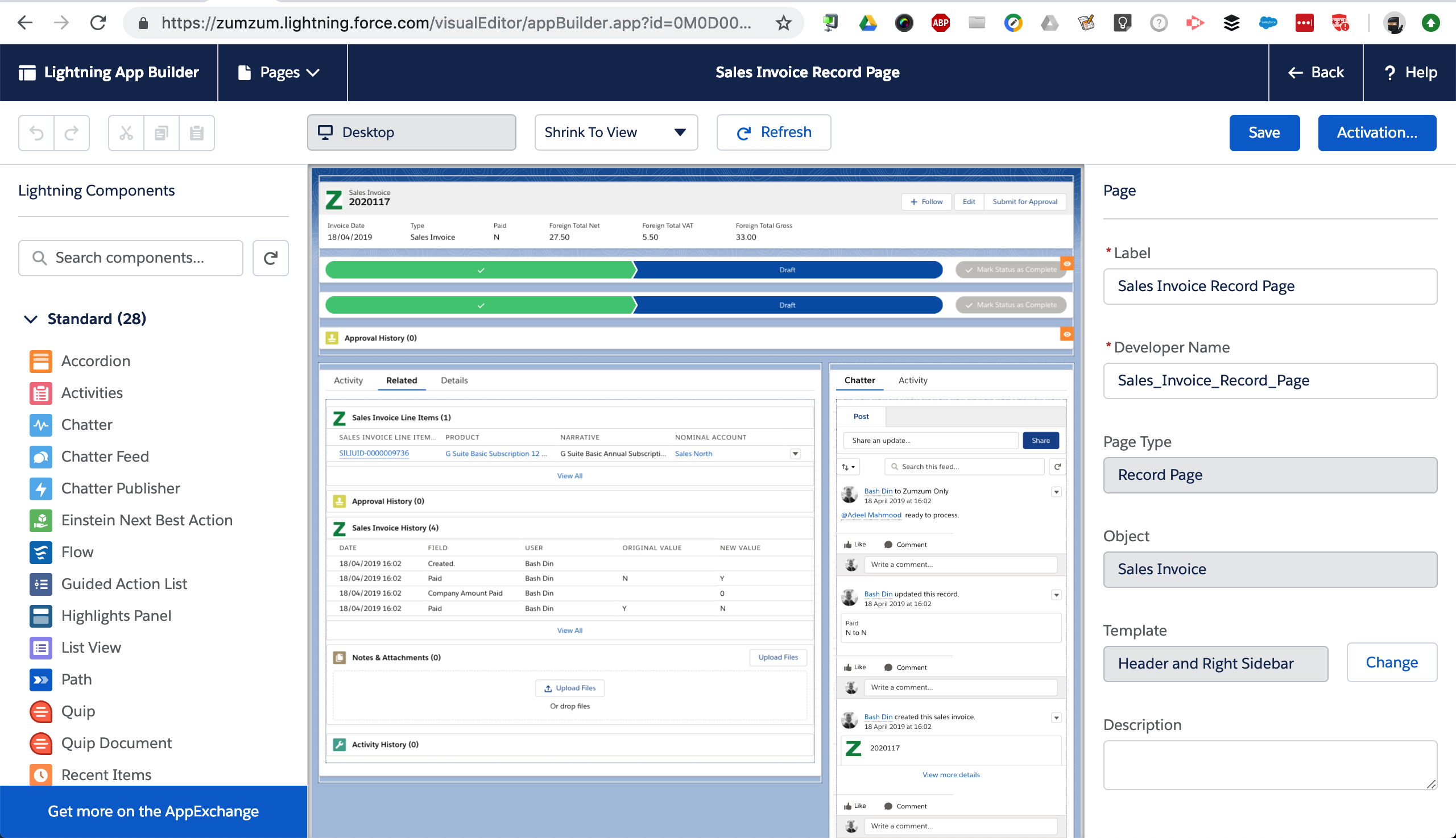
To highlight this exciting capability, here is an example of a Sales Invoice Lightning Page, which dynamically displays the approval related list, until the record is approved and then is hidden when the record is approved.
To put this together, you can see here that we have added the single related list component at the top of the lightning page.

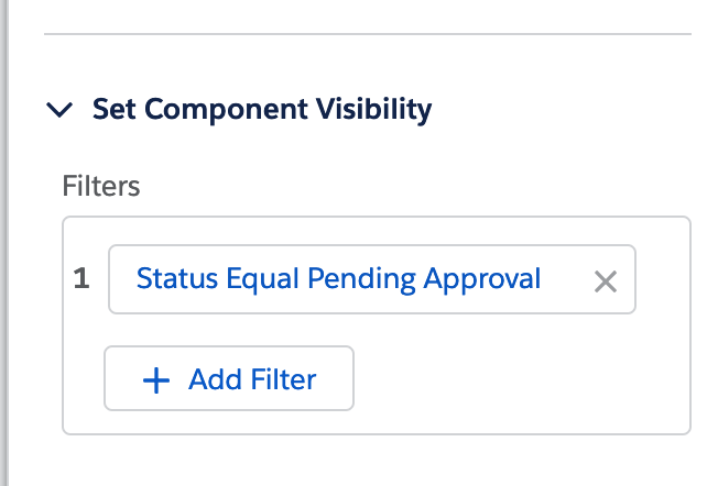
Then, when you select the component, in the extreme right-hand bottom corner, you will be able to set the component visibility be setting the criteria. In this example, we are using the Sales Invoice “Status” field.

Just for good measure, we also added component visibility filters to the paths on the page, that display only on the relevant record type.

I hope you find this Salesforce Lightning tip useful, and let us know in the comments below the types of user experiences you are creating with Dynamic Lightning Pages.
